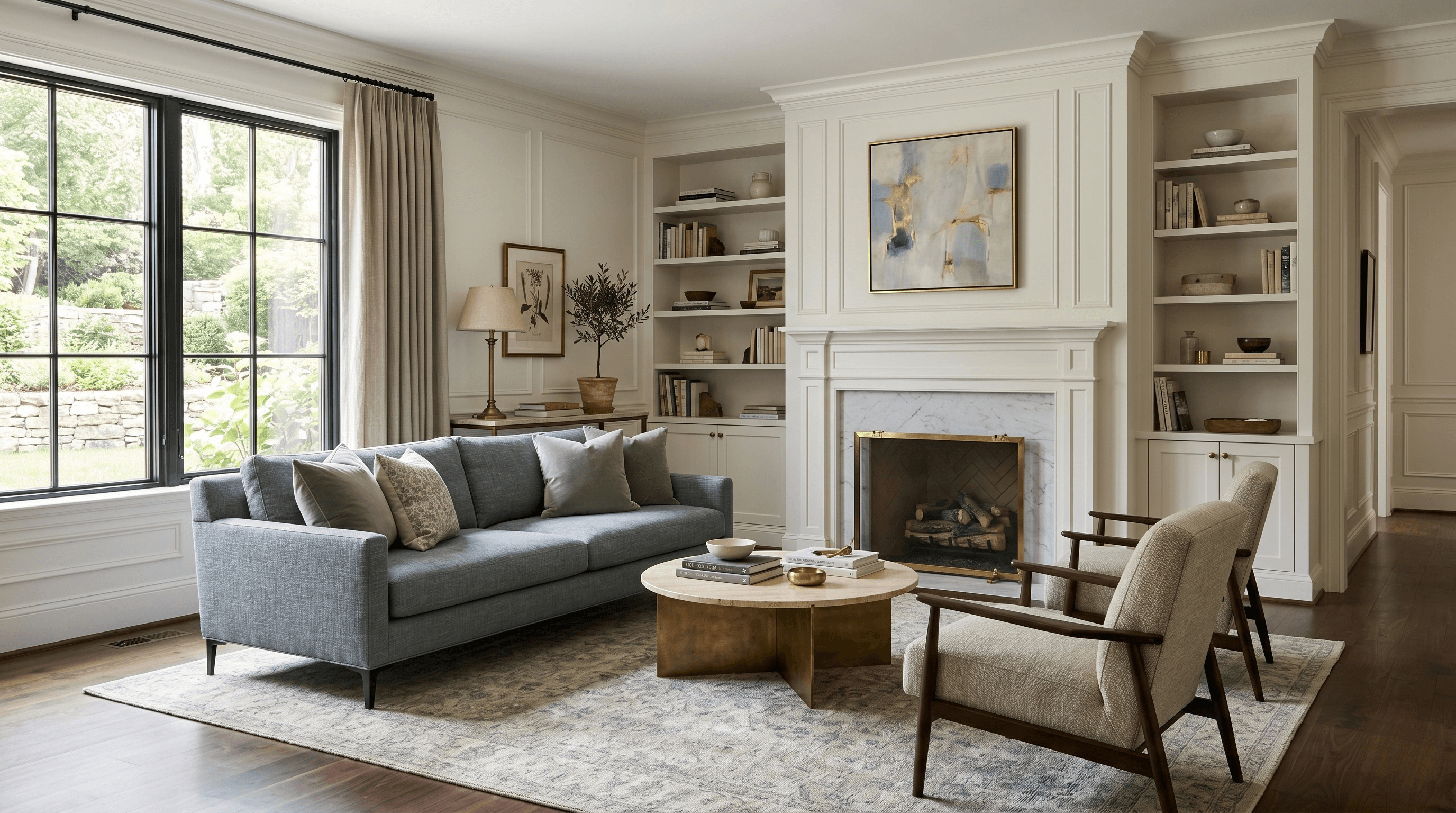
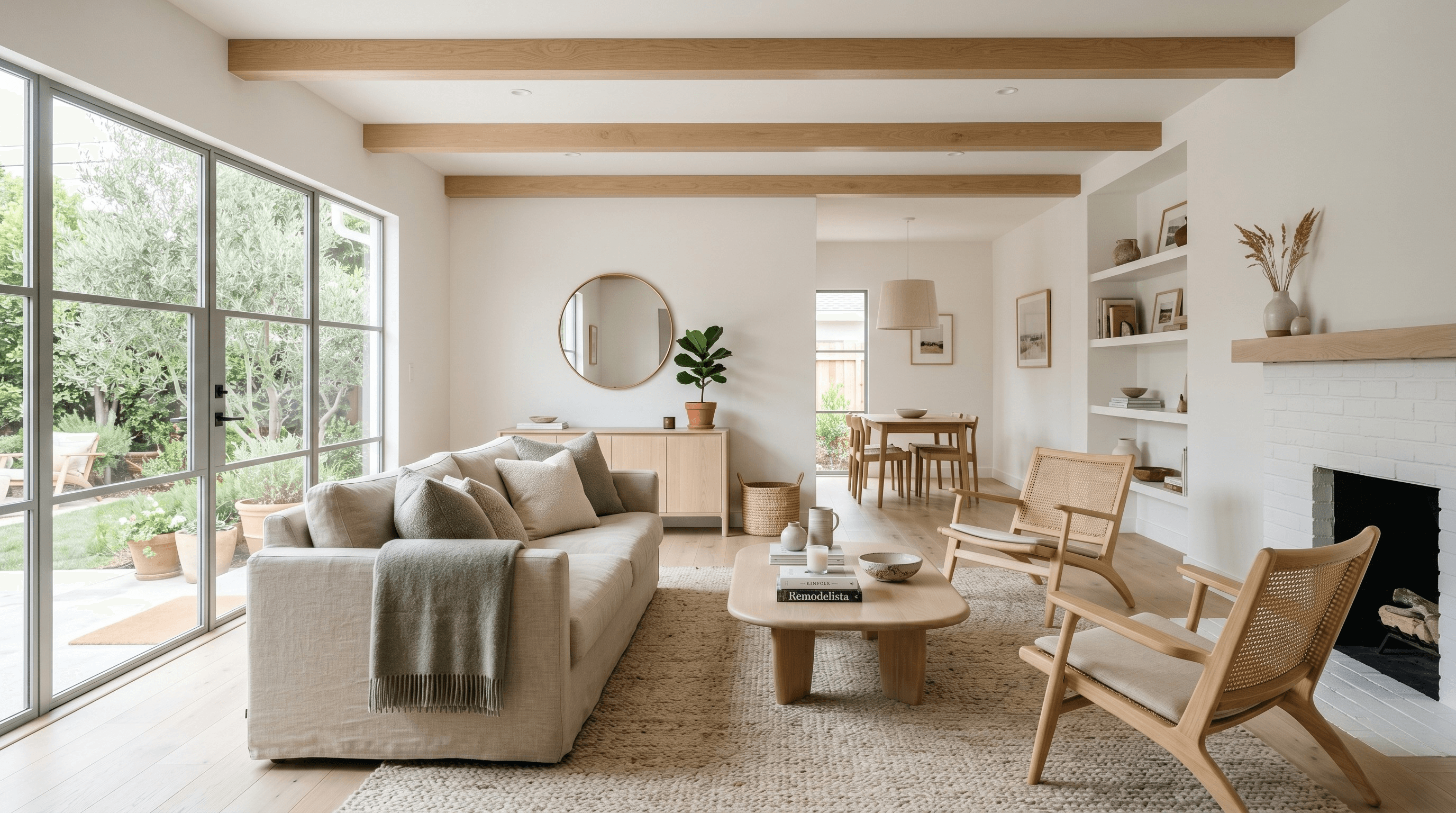
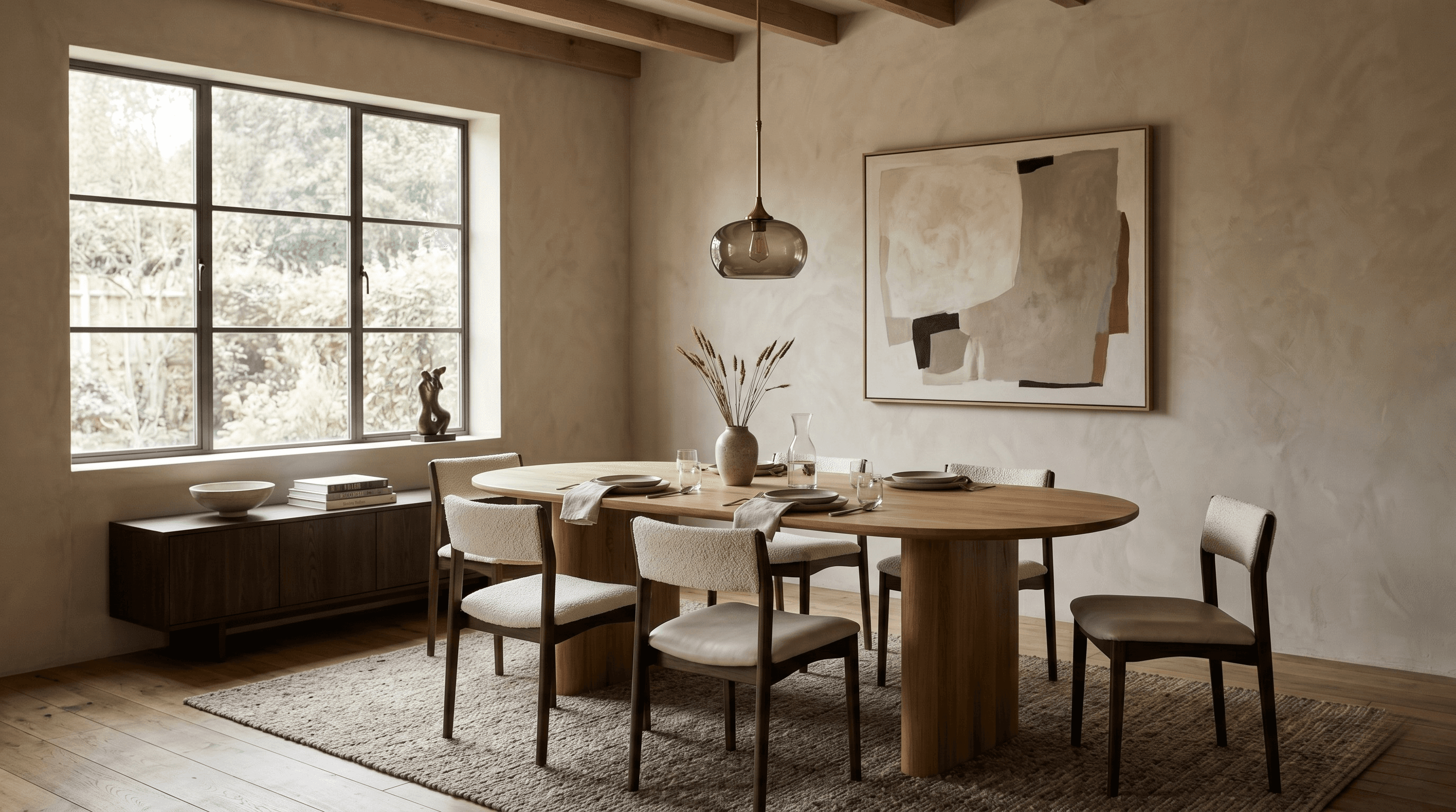
You like your sofa. The coffee table is good. You finally found art you don’t hate. You’ve moved the pillows around approximately 47 times.
And somehow, the room still looks... off.
Maybe it feels unfinished. Maybe it looks better in one corner than another. Maybe every individual piece is technically nice, but when you stand back, the whole room feels slightly disconnected.
This is usually the point where people assume they need more styling.
Another lamp. More objects on the coffee table. A different throw. Maybe a decorative bowl will finally restore balance to the universe.
Usually, it won’t.
When a room doesn’t feel finished, the issue often starts much earlier in the design process. Scale, layout, lighting, proportion, rhythm and visual hierarchy have a much bigger impact on how a room feels than the accessories sitting on top of it.
That’s the frustrating part. You can have a room full of good things and still not have a good room.
Styling can finish a strong foundation. It cannot rescue a weak one.
So before you buy another pillow, candle, basket, lamp or suspiciously expensive sculptural object, look at these seven design problems first:
- Your rug is too small
- The furniture fits, but the scale is wrong
- The layout fights the room
- Your lighting is flat
- Everything is happening at the same height
- There is no clear focal point
- The room has no visual thread
1. Your rug is too small
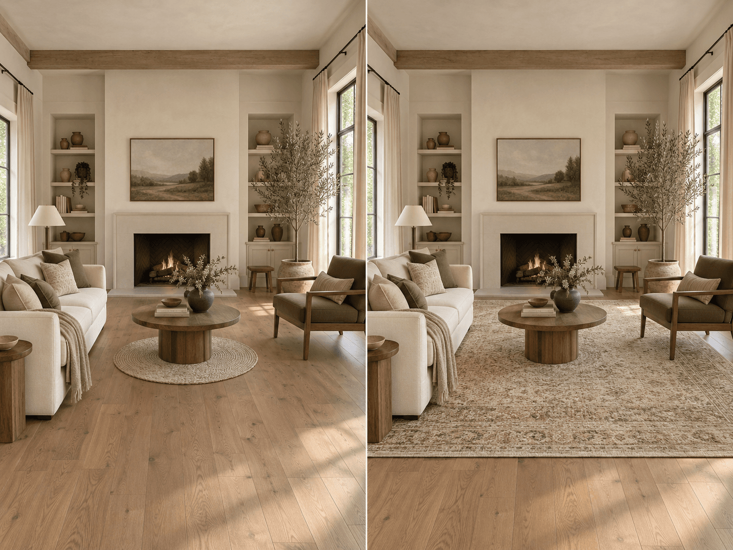
This one is painfully common because rugs have the annoying habit of looking enormous online and approximately the size of a bath mat once they arrive.
A rug does more than cover the floor. It visually defines the seating area.
When it’s properly sized, it connects the sofa, chairs and tables into one composition. When it’s too small, every piece feels like it’s floating independently around the room.
You get:
- —Sofa over here
- —Chair over there
- —Coffee table stranded in the middle
The rug becomes a decorative island rather than the thing grounding the entire arrangement.
In most living rooms, you want the rug to extend under at least the front legs of your primary seating pieces. In larger rooms, having all four legs of major furniture pieces on the rug can create an even stronger sense of cohesion.
But the more useful rule is this:
The rug should relate to the whole seating group, not just the coffee table.
A 5x7 rug may technically fit between the sofa and chairs. That doesn’t mean it belongs there.
The same issue happens in bedrooms. A tiny rug placed at the end of the bed may add some softness, but it usually won’t make the room feel finished. A larger rug that extends beyond the sides of the bed makes the entire sleeping zone feel intentional.
The sign
Your furniture looks like it is circling the rug instead of sitting on it.
You may also notice a lot of exposed flooring between the rug and the furniture, which visually breaks the room into smaller pieces.
The fix
Size up before adding anything else.
A larger rug can make a room look more finished without changing a single piece of furniture.
And strangely enough, it can also make a small room feel larger. A larger rug creates one continuous visual field. A tiny one chops the floor into separate zones and makes the room feel more fragmented.
If you’re choosing between two sizes and both physically fit, the larger one is usually the better choice.
Not always. But often enough that the smaller rug deserves suspicion.
2. The furniture fits, but the scale is wrong
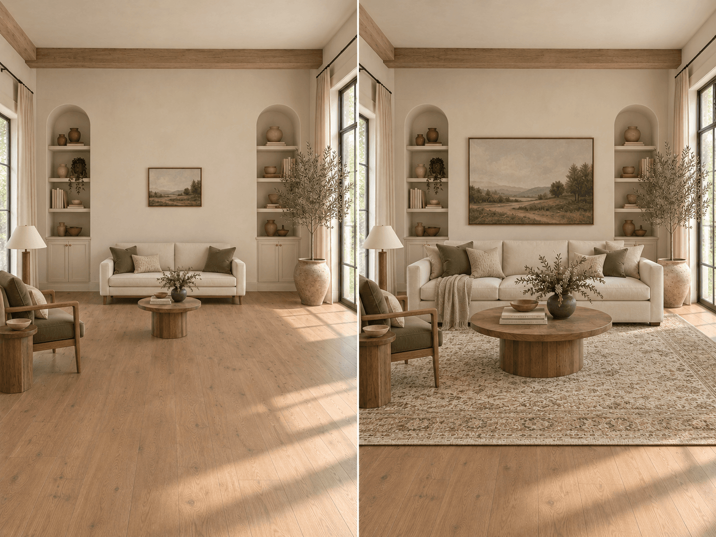
There is a major difference between “it physically fits in the room” and “it is the right size for the room.”
A sofa can fit perfectly along a wall and still look completely wrong there.
Scale is about relationships.
- —How large is the sofa compared with the wall behind it?
- —How substantial is the coffee table compared with the sofa?
- —How much empty space surrounds the furniture?
- —How tall is the ceiling?
- —How visually heavy are the other pieces in the room?
A small sofa along a large blank wall can make the entire room look sparse and unfinished.
An oversized sectional squeezed into a narrow living room can make it feel like the furniture has staged a hostile takeover.
The same thing happens with coffee tables, nightstands, lamps, pendants and artwork.
A tiny coffee table paired with a deep sectional may look accidental. A delicate side table next to a massive upholstered chair can feel visually weak. A small artwork hung over a wide sofa can make the wall feel emptier than if there were no artwork at all.
Scale problems are tricky because nothing is necessarily “wrong” in isolation.
The chair may be beautiful. The sofa may be beautiful. The coffee table may be beautiful.
They just don’t look like they were invited to the same room.
The sign
One or more pieces look strangely tiny or enormous, even though the measurements technically work.
You may also notice too much dead space around furniture or the opposite, where the room feels packed and difficult to move through.
The fix
Evaluate pieces as a group, not individually.
Ask:
- —Does the coffee table feel substantial enough for the sofa?
- —Does the artwork relate to the width of the furniture below it?
- —Does the chair have similar visual weight to the sofa?
- —Does the room still have enough breathing space once everything is in place?
Scale doesn’t mean everything should be large.
It means each piece should make sense relative to the room and everything around it.
That relationship is what creates balance.
3. The layout fights the room
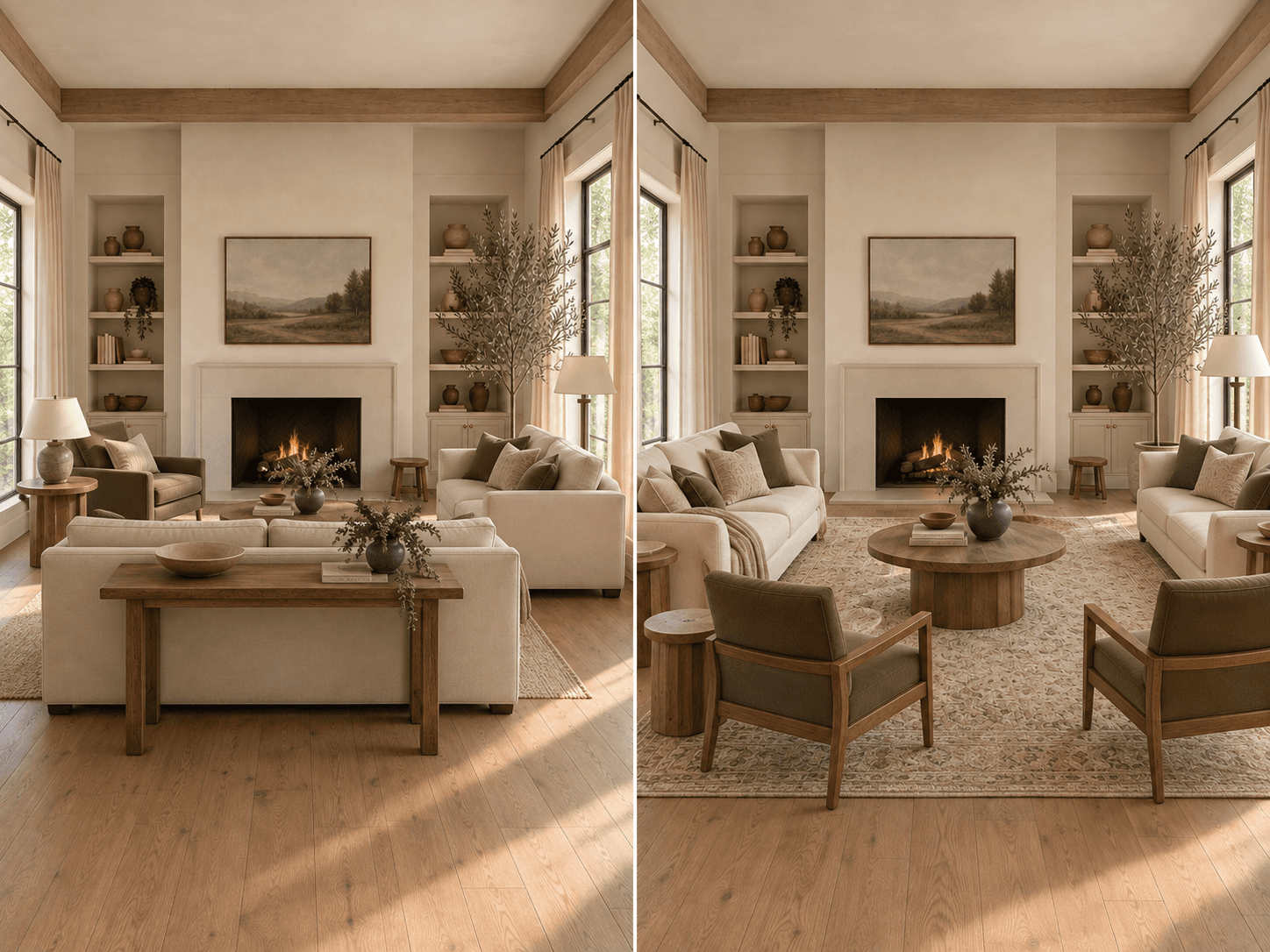
Sometimes every piece in the room is perfectly good.
It’s just sitting in the wrong place.
Furniture placement should respond to three things: how people move through the room, how they use the room and what the room naturally wants to focus on.
Instead, many rooms are designed almost entirely around the perimeter.
Sofa against wall. Chair against wall. Console against wall. Everyone standing along the edges like they’re attending a middle-school dance.
Pulling furniture inward can immediately make a room feel more intentional.
In a larger living room, a sofa floating several feet away from the wall might create a much stronger conversation area. A pair of chairs can help define the opposite side. A console behind the sofa can help transition between zones.
In a smaller room, the solution may be different. Maybe the sofa does need to sit against the wall. But the chair could angle toward it instead of being pushed into a corner for no apparent reason.
There’s also circulation.
This is where a layout can look fine in a photograph but feel incredibly irritating to actually live in.
If someone has to sidestep a chair, squeeze between the coffee table and sofa, or cut straight through the center of a seating group every time they enter the room, the layout is fighting the architecture.
Furniture should guide movement, not create a low-grade obstacle course.
The sign
The room looks acceptable from one angle but feels awkward when you actually walk through it.
You may also find yourself constantly moving around the same chair or bumping into the same corner of a table.
That is not a personality flaw. That is your floor plan trying to tell you something.
The fix
Start with circulation before styling.
Identify:
- —Where people enter
- —Where they naturally walk
- —Which doors, windows and pathways need to stay clear
Then build the furniture arrangement around those paths.
After that, think about how people actually use the room. Do they watch television? Talk? Read? Entertain? Work from the sofa?
The layout should support those behaviors instead of merely looking symmetrical.
A good layout usually feels obvious once it is right.
You stop noticing the furniture placement because moving through the room becomes effortless.
4. Your lighting is flat
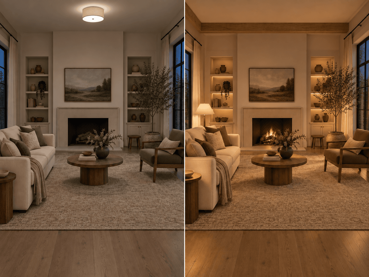
One ceiling fixture is technically lighting.
It is not a lighting plan.
Lighting completely changes how a room feels.
The same sofa, paint color, rug and artwork can look expensive and atmospheric under layered lighting and completely lifeless under one bright overhead fixture.
Rooms feel richer when light comes from different heights and directions.
Think of lighting in layers:
- —General lighting helps you see the room.
- —Task lighting helps you do something specific, like read beside a chair.
- —Accent lighting highlights shelves, art or architecture.
- —Ambient lighting creates mood.
You do not need every category represented seven times.
You just want more than one light source doing all the work.
A living room might have a ceiling fixture, a floor lamp near a reading chair and a table lamp on a console.
That alone can create significantly more depth than an overhead fixture blasting every surface equally.
Color temperature matters too.
Very cool light can flatten warm materials and make a room feel clinical. Warmer lighting tends to flatter wood, textiles and skin tones and makes living spaces feel more comfortable in the evening.
There’s also the simple reality that interiors are experienced differently after dark.
A room might feel fantastic at 2 p.m. with sunlight pouring through the windows and then strangely bleak at 8 p.m.
That’s a lighting problem, not a styling problem.
The sign
The room looks good during the day and vaguely depressing after sunset.
Or everything looks evenly illuminated but nothing feels dimensional.
The fix
Add light at more than one height.
Start with the places where lighting has an actual function: beside the sofa, near a reading chair, on a console.
Then look for one or two opportunities to create atmosphere.
Maybe it’s shelf lighting. Maybe it’s a picture light. Maybe it’s a lamp glowing softly in the corner whose only job is to stop your living room from feeling like a waiting room.
That is still a job.
5. Everything is happening at the same height
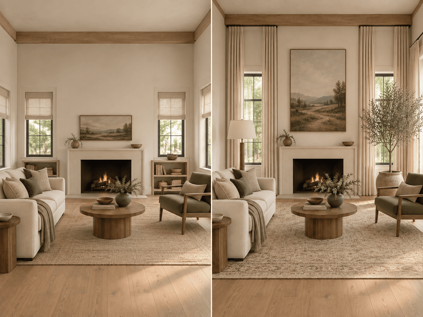
Stand back and look at your room.
Now imagine drawing a horizontal line across the tops of everything.
If your sofa, chairs, console, coffee table, art and accessories all live in roughly the same visual band, the room can feel strangely flat.
Rooms need vertical rhythm.
Your eye should move around the space. Low. Medium. High. Back down again.
That movement can come from:
- —Tall drapery
- —Floor lamps
- —Large-scale art
- —Bookshelves
- —Trees and plants
- —Pendants
- —Sculptural lighting
- —Architectural details
Even one taller piece can change the composition.
Think about curtains.
Curtains mounted just above the window frame emphasize the window.
Curtains mounted higher and extended beyond the sides can make the entire wall feel taller and more generous.
The same applies to art.
A tiny piece centered over the sofa may leave a huge amount of visual emptiness above it.
One larger piece can create better proportion and draw the eye upward.
The sign
The lower half of the room feels busy while the upper half feels completely abandoned.
Or the whole room feels visually compressed even though the ceilings are a perfectly normal height.
The fix
Introduce a mix of low, medium and tall elements.
Maybe that means replacing a small plant with a tree. Maybe it means adding a floor lamp. Maybe the drapery needs to start higher. Maybe the artwork needs more scale.
You are not trying to fill every wall.
Please don’t.
Negative space is useful.
The point is to create variation, not cover every vertical surface like your room is preparing for an estate sale.
6. There is no clear focal point
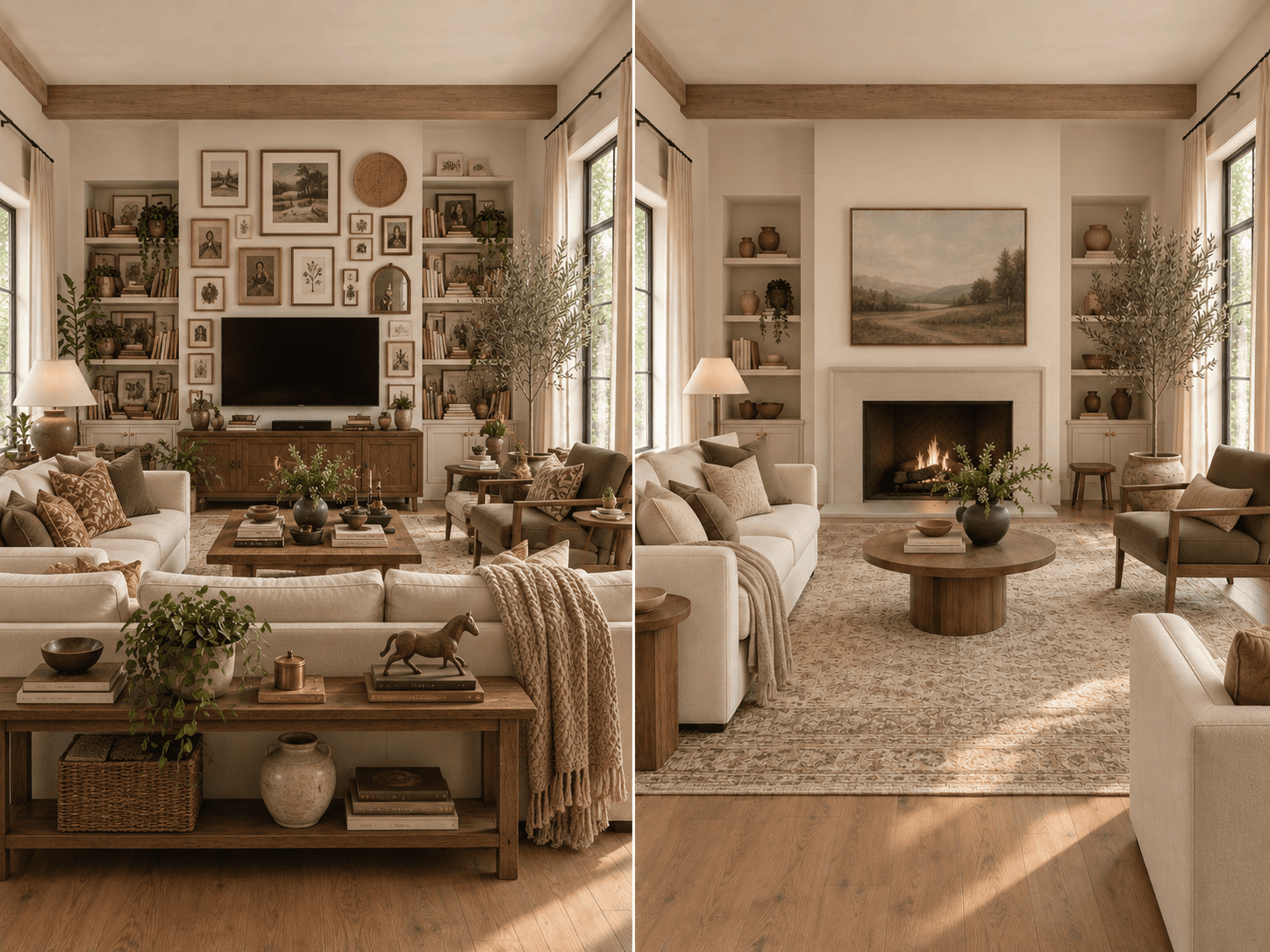
When you walk into a well-designed room, your eye usually knows where to go first.
Maybe it’s a fireplace. A large piece of art. A dramatic window. A beautiful bed. A sculptural light fixture. A strong furniture grouping.
The rest of the room supports it.
Problems start when every element tries to be the main character.
A gallery wall. A giant television. A patterned rug. A bold chair. Statement pillows. A dramatic light. Decorative shelving. All happening at once.
Individually, those things may be great.
Together, they can create visual noise.
A focal point doesn’t mean everything else has to be boring. It simply creates hierarchy.
Some elements lead. Some support. Some sit quietly in the background and behave.
That hierarchy gives your eye somewhere to rest.
The sign
You walk into the room and don’t know where to look first.
Or several areas of the room feel equally demanding.
The fix
Choose a hierarchy.
Identify the strongest architectural or visual feature.
If you have a fireplace, that may already be the natural focal point.
If you don’t, maybe it’s the sofa wall with one large piece of art. Maybe it’s the window. Maybe it’s the media wall.
Once you identify it, make sure the surrounding choices support rather than compete with it.
A bold rug may still work, but perhaps the artwork needs to be quieter.
A gallery wall may work, but then the accessories around it probably don’t need to scream too.
Not everything needs its own press conference.
7. The room has no visual thread
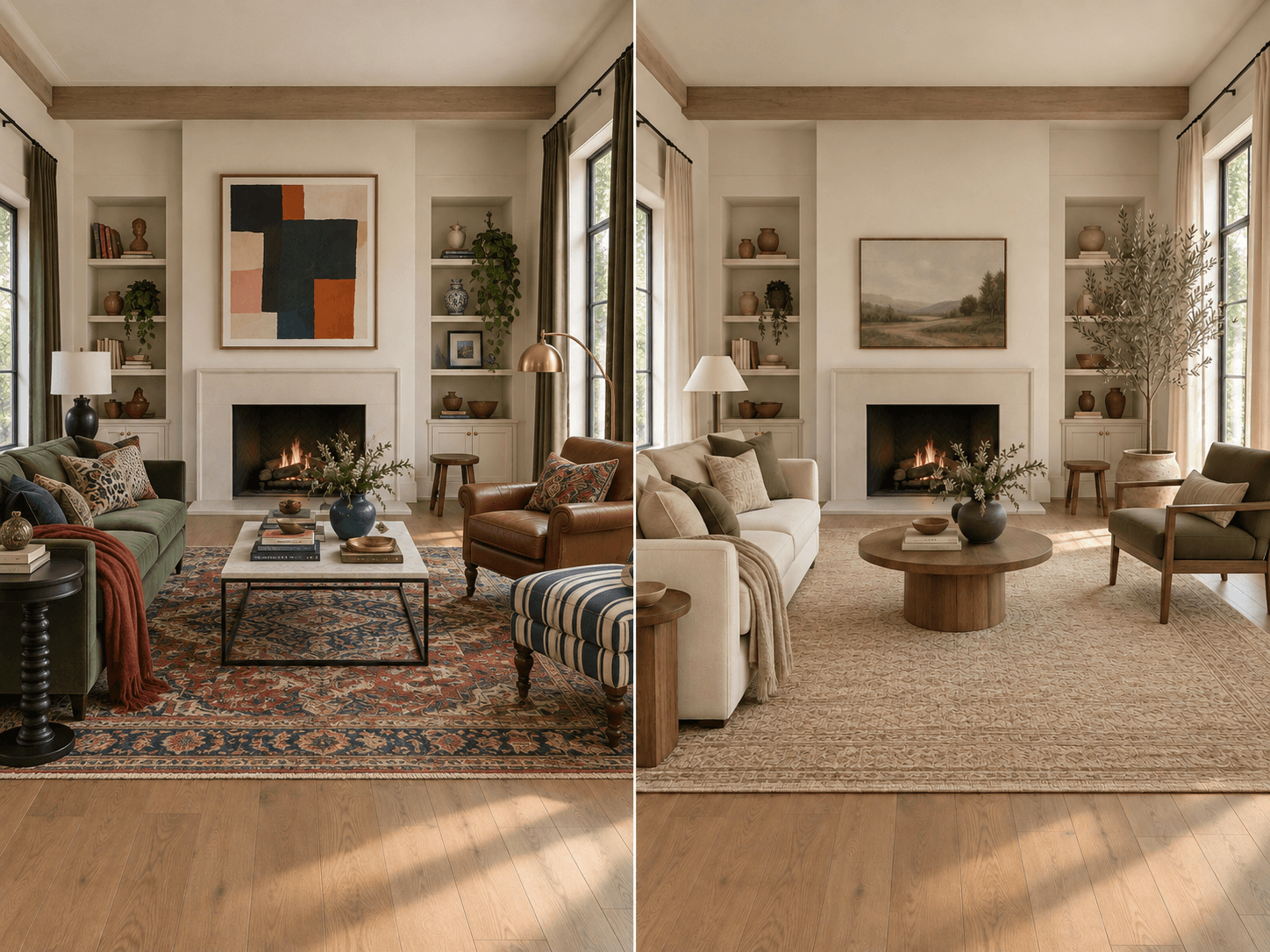
This is the problem people most often try to solve with styling.
They add more pillows. More objects. More color. More decor.
And somehow the room feels even less cohesive than before.
That’s because cohesion usually comes from repetition.
Not matching. Repetition.
A room might repeat:
- —Warm wood tones
- —Black metal
- —Soft curves
- —Olive green
- —Aged brass
- —Linen
- —Stone
- —A particular shape
Those repeated elements create a visual thread from one part of the room to another.
Without one, a room can feel like it was assembled from several completely different ideas.
Imagine a living room with:
- —A cool gray sofa
- —A reddish cherry console
- —A yellow oak coffee table
- —Chrome lighting
- —Black industrial shelving
- —A pastel rug
- —Brass accessories
Technically, you can mix finishes.
Good rooms often do.
But if there is no intentional relationship between them, the result can feel random instead of layered.
The solution is not making everything identical.
It is creating enough repetition that the mix feels deliberate.
The sign
You like everything individually, but together the room feels disconnected.
The pieces seem to belong to different rooms, different styles or different color stories.
The fix
Look for connections.
Choose a few materials, colors, finishes or shapes to repeat.
If there’s warm walnut on one side of the room, bring a related wood tone somewhere else.
If olive green appears in a chair, repeat it subtly in a pillow, art or plant material.
If your coffee table has strong curves, maybe a rounded lamp or mirror echoes that shape.
Repetition is what turns separate choices into a composition.
Cohesion does not mean everything matches. It means everything looks like it belongs to the same conversation.
Before you style, diagnose
Styling matters.
It is often the final layer that makes a room feel personal, lived-in and complete.
Books, art, pillows, objects, plants and textiles give a space personality.
But styling works best when the underlying decisions are already doing their jobs.
If your room still looks unfinished, resist the urge to immediately buy more things. Instead, step back and look at:
- —Rug scale
- —Furniture scale
- —Layout
- —Lighting
- —Vertical rhythm
- —Visual hierarchy
- —Cohesion
Then identify the biggest problem.
Fix that first.
You may find that the room needs far less “decorating” than you thought.
Sometimes the difference between a room that feels almost right and one that finally clicks is not another pillow.
It’s moving the chair six inches. Replacing the too-small rug. Adding one floor lamp. Hanging the curtains higher. Removing three competing pieces of art.
Or admitting that the adorable little coffee table is simply too adorable and little.
See the room before you commit
The frustrating thing about design is that many problems are easier to see after the furniture is already sitting in your house.
A sofa may look perfectly proportioned on a product page and completely different once it’s in your actual room.
The paint color changes with your light. The rug looks smaller than expected. The layout you imagined suddenly blocks the doorway.
This is exactly why testing design decisions visually can be so useful.
With Veyah Room Edit, you can upload a photo of your actual room and explore different furniture, finishes, paint colors and design directions before committing to them in real life.
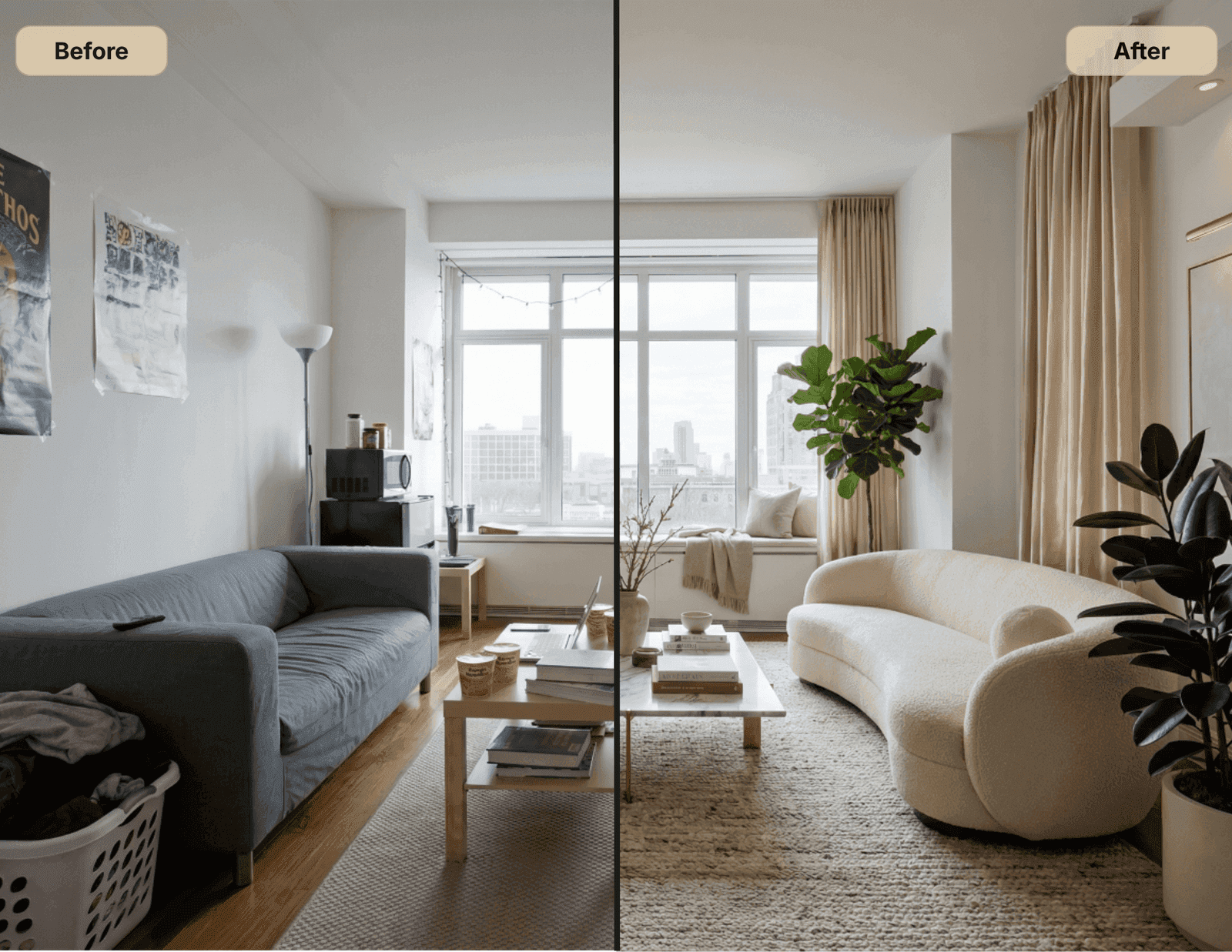
Instead of trying to mentally picture whether a darker wall color, larger rug or different sofa would work, you can see the change in the context of your own space.
Because “I think this works” is considerably less expensive when you can test it first.
And sometimes the problem isn’t choosing between two options.
It’s knowing what needs to change at all.
That’s where Vibe Check comes in.
You send in your room, and a designer identifies what is working, what feels off and which changes will make the biggest impact.
Not a complete redesign. Not twenty new things to buy. Direction.
Because sometimes your room doesn’t need more.
It just needs the right thing fixed.
And once the foundation makes sense, the styling part becomes a lot easier.